This initial idea goes back to a nurse in a hospital. She wanted to give teenagers and young adults a guide after the time of the diagnosis of Multiple sclerosis. The time after the diagnosis is difficult, not predictable and a lot of question about the future need to be answered.
research
Concept
UX-Design
UI-DEsign
prototype
Concept
UX-Design
UI-DEsign
prototype
2019
Situation
Patients get only little material (folder). Doctors don't take the time it needs to talk to patients, partly lack of empathy for the situation. And eventually, what are relevant questions for a teenager/young adult and what is the best way to reach them?
excerpt of the Kick-off board with research material
Research
When I researched teenagers and young adults with MS, I realized that it was more helpful and interesting to read and watch stories by patients and how they deal with multiple sclerosis than the advice articles by professionals. My assumption: "personal stories from peers are more valuable than doctors advice". I used this approach for the main idea into the pitch concept. Later in the process, I validated my assumption in interviews with patients.
The target group is from 16Y (teenagers) – 26y (young adultS). All these events are first-time experiences.
Concept
The original concept for the app was to have, questions answered by professionals. With the assumption (personal stories from the same peers are more valuable than doctors advice) I created a second content block where I wanted to empower the patients answering the question of how they dealt with a particular challenge.
Extended concept
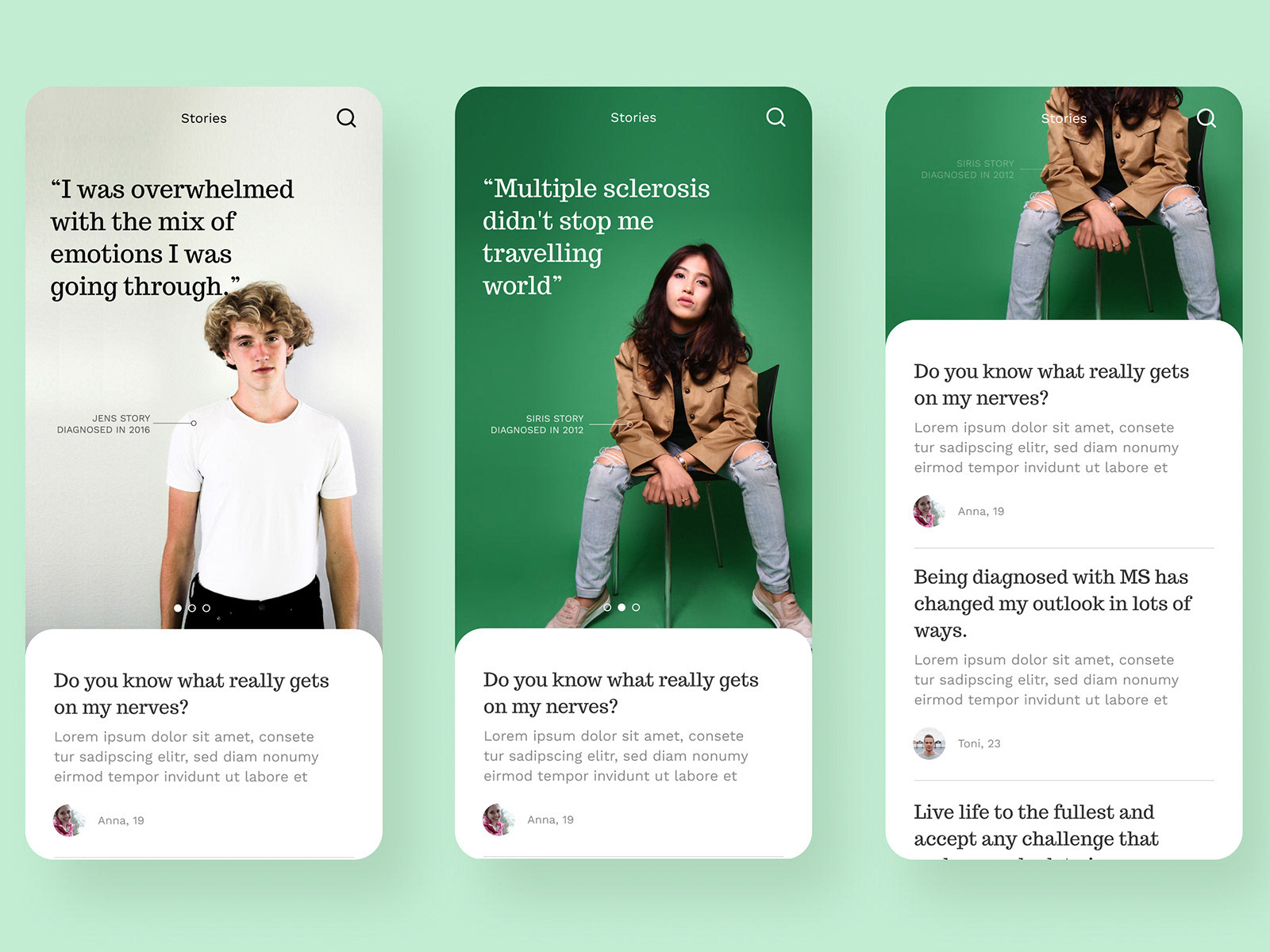
Later in the process, we came up with the idea of "stories" by multiple sclerosis patients, which gives us more freedom and possibilities.
Final Concept
We came up with the idea of stories. patients write about their Experience with Multiple Sclerosis. structure test and wire frames.
Ideas for content, functionalities and illustrations.
Wire frames and prototype
MVP
Since we already had a professional team writing the answers for the “question & answers” part, it was evident for us to start with that. That was the part with the highest value and enough content to have a first version of the app. We decided to deliver the story part at a later stage, that gave us time to test the app with MS patients and plan for further functionalities.
Category overview page and and a category page with an introduction and the questions (Mood Illustrations)
